This is what we found out:
(note: our findings are solely based on the people we gathered this information on, mainly teenagers from Cypress High School)
The graphs we chose were the bar graphs because they were more favourable in terms of the
types of information we needed to have arranged. The advantage of using these graphs are
that they group each category into separate graphs, use the information given, and plot
them into a bar chart. The bars include the choices given and how many picked that choice.
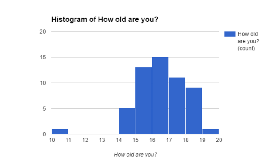
How old are you?
What type of physical activities do you do?

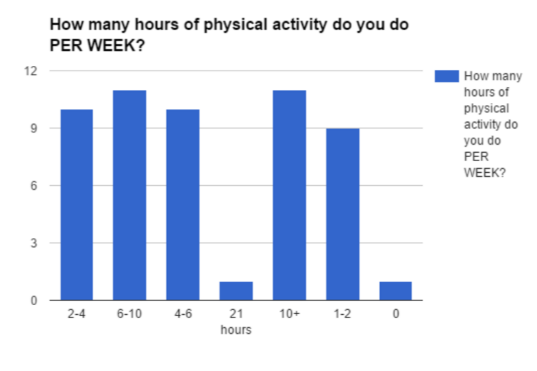
How many hours of physical activity do you do per week?
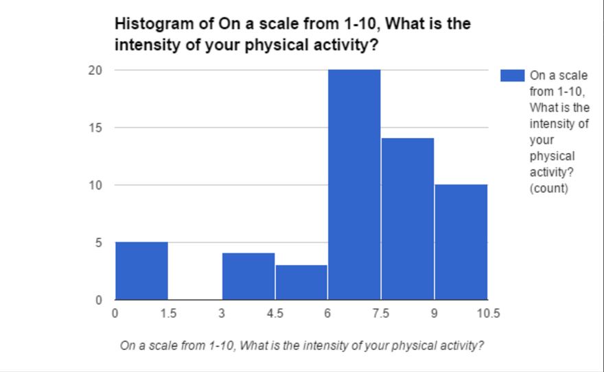
On a scale from 1-10, how intense is your physical activity?
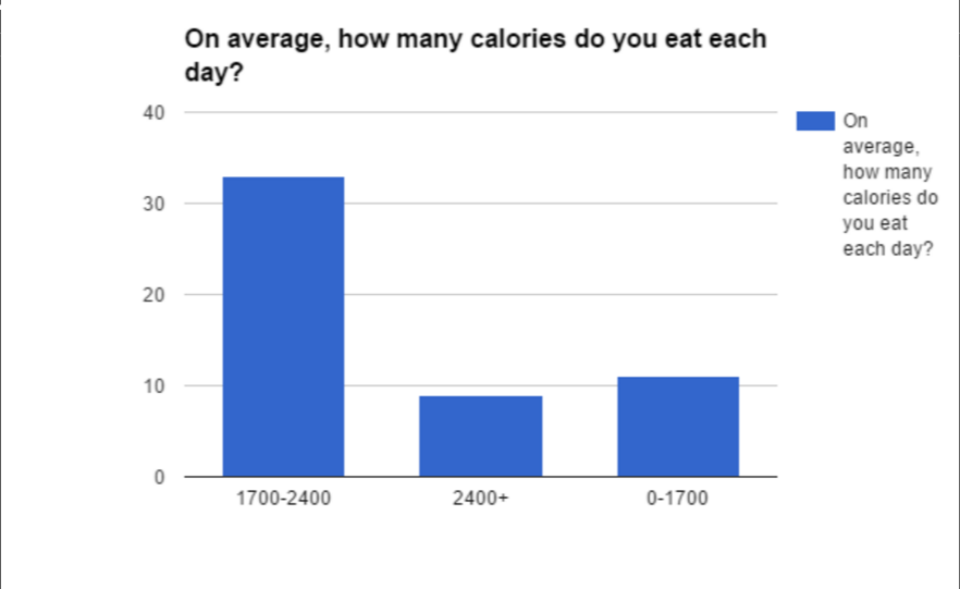
How many calories do you eat everyday? (average)
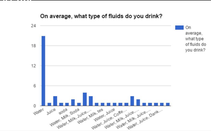
What type of fluids do you drink?
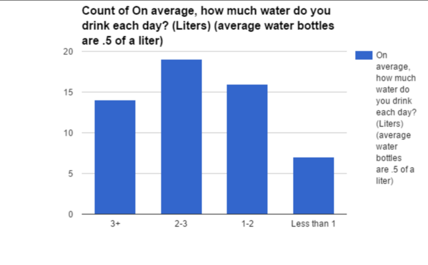
How many liters of water do you drink daily? (average)
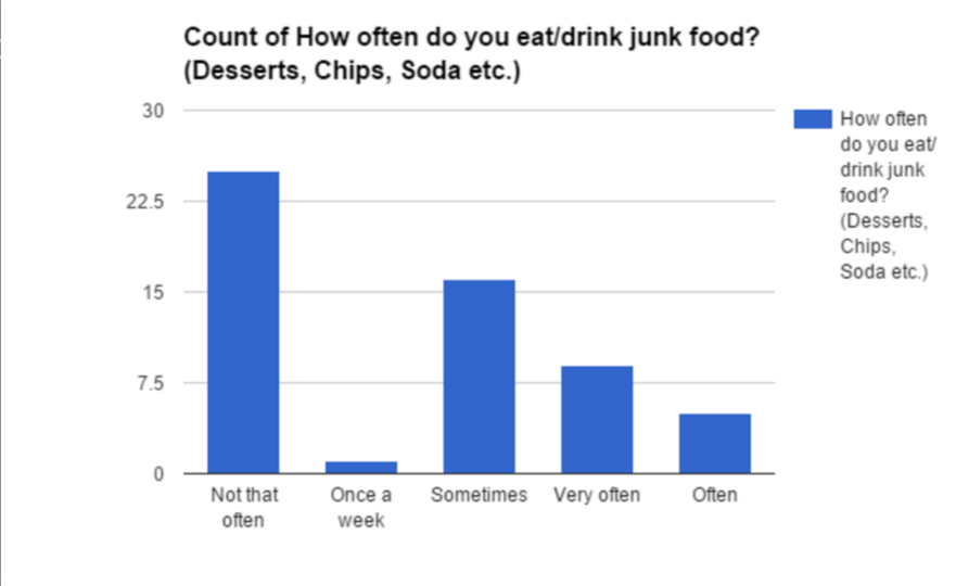
How often do you eat junk food?
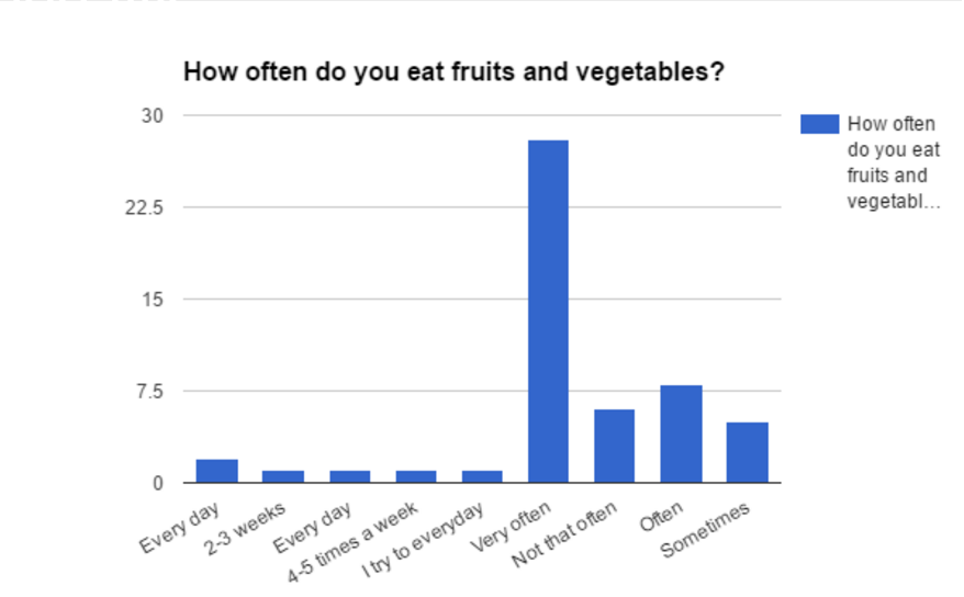
How often do you eat fruits or vegetables?
How much sleep do you get per night? (average)
